
Qantas Loyalty
The journey to creating a seamless mobile experience
Working with a highly skilled team at Qantas Loyalty, I embarked on a journey from conception to delivery and user testing, which spanned over 8 weeks. Our mission was to create a proof of concept (POC) that would eventually evolve into a cross-platform mobile application - Qantas Money.


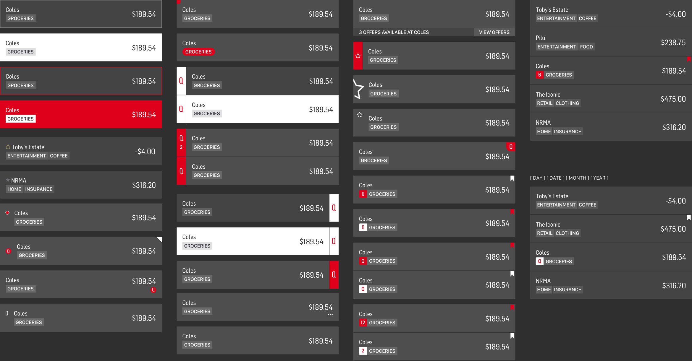
Cell Grouping
An exploration into grouping/chunking of transactional data – which can be viewed easily when there is a lot of seemingly repetitive data.


Transaction cell indicators
An exploration of subtle indicators as a non-intrusive notification system that can be scanned quickly in any extended list format.
Crafting simplicity
As a team, we eagerly jumped into this project, conducting thorough research and analysing past and present comparative data. This allowed us to gain invaluable insights into customer experience and expectations. Our aim was precise: to simplify and enhance the user journey. Guided by the '1 screen 1 task' design principle, aiming to craft each application element meticulously to ensure seamless interaction.
The venture was challenging but incredibly rewarding. We generated many premium design concepts and developed working prototypes as we progressed. These prototypes showcased our vision and served as a tangible representation of our hard work and dedication.
One of the most satisfying moments was witnessing the success of our POC. We validated our ideas through rigorous user testing and refinement and proved our concept's viability. This success paved the way for the next development phase, as we eagerly handed over assets to the development team to bring our vision to life.

Categorisation A dive into categorisation layouts for mobile devices, showing the progression from extra information to a more simplified UI.

Secondary navigation Also, here is a sample of a quick exploration into secondary navigation, looking to simplify the standard tabulated offering to a cleaner option.
